How to enlarge an image for printing without losing quality
Enlarging an image for print reduces to one division problem: pixels ÷ inches = DPI. Take the pixel width of your file, divide by the width you want on paper, and the result tells you — before you spend a sheet of paper or a drop of ink — whether the enlargement will hold up. This guide works that formula through real numbers, shows where the quality thresholds actually sit, and answers the narrower question of when upscaling earns a place in the pipeline.
Divide the pixel width of your file by the width you want on paper; the result is the DPI, and 100 or more will hold up on a wall.
On this page
The formula, worked three times
First, a decent photo at a sane size. A 3000 × 2400 px photo printed 10 inches wide: 3000 ÷ 10 = 300 DPI. That's photo-book sharp. You can hold it at reading distance and find nothing to complain about.
Next, the same file three times wider. Print that identical 3000 × 2400 px photo at 30 inches and the math becomes 3000 ÷ 30 = 100 DPI. Nothing about the file changed; the same pixels are just spread across nine times the area. At 100 DPI the print looks soft with your nose against it and perfectly fine from across the room — an amber result, in the tool's terms.
Last, a small logo that can't be saved. A 1200 px-wide logo stretched to 24 inches: 1200 ÷ 24 = 50 DPI. That's half of borderline. Edges stair-step, curves shatter, and no viewing distance inside the same room rescues it. A file like this needs to be re-exported from the vector original, or printed at 8 inches instead of 24.
Run the division on your own file before deciding anything else. It takes ten seconds and settles most arguments about whether an enlargement is realistic.
The readout runs this math for you, live
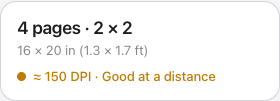
Free Image Splitter displays an effective-DPI readout that updates as you adjust the print size, so you can watch a file cross the thresholds instead of computing them by hand. The bands: green at 200 DPI and above (sharp at arm's length), amber from 100 to 199 (clean at normal wall-viewing distance), red below 100 (visibly soft up close). One detail worth knowing: the grade is computed from the source file's pixels per printed inch, so the number never flatters you. The 150/200/300 DPI export presets work the same honest way, with an automatic floor at the source resolution — a high-resolution file is never downsampled to match a preset.
Viewing distance moves the goalposts
DPI thresholds aren't absolute; they're a proxy for what the eye can resolve at a given distance. The farther the viewer stands, the fewer dots per inch you need:
| How it's viewed | Typical distance | Aim for |
|---|---|---|
| Held in hand, on a desk | ~1.5 ft | 250–300 DPI |
| Framed wall art | 3–6 ft | 120–180 DPI |
| Posters and banners | 6 ft and up | 80–120 DPI |
This is why an amber grade is a verdict, not a warning to panic over: for a poster hung over a sofa, 150 DPI is exactly enough, while for a print someone will pick up and study, it isn't.
Where 300 DPI comes from
The magic number isn't arbitrary. An eye with 20/20 vision resolves detail down to about one arcminute, which at a 12-inch reading distance works out to roughly 300 distinct dots per inch — resolution beyond that is invisible. Double the distance and the resolvable detail halves, which is exactly why the table above slides from 300 toward 100 as prints move onto walls. Physiology and the formula agree: sharpness is pixels per inch per unit of viewing distance, and everything else is convention.
When upscaling actually helps
Upscaling cannot recover detail that was never captured — a resampled file has more pixels, not more information. What it changes is how the shortfall looks. Send a small image straight to the printer at a large size and the printer driver performs its own fast interpolation, which tends to produce a visible pixel grid and blocky, stair-stepped edges. Resample first with a good algorithm and the same enlargement renders as smooth softness instead — noticeably easier on the eye at the identical effective resolution.
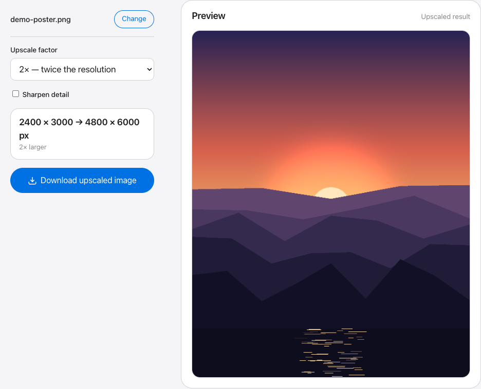
The homepage upscaler handles this without leaving the browser: 2× or 4× stepwise high-quality resampling, an optional unsharp-mask sharpen, capped near 40 megapixels. Where it won't help: when the readout is deep red — the 50 DPI logo from the third example — no resampler fixes the underlying pixel deficit. Print smaller, or go back for a bigger original.
Enlarging without the blur: two habits
- Sharpen after resampling, not before. Resampling softens edges slightly; the upscaler's unsharp-mask option counteracts exactly that. Sharpening first only amplifies noise that the resize then smears around.
- Stay in PNG. Every JPG save re-compresses the image, and compression artifacts that hide at screen size get enlarged along with everything else. Keep the working file in PNG until it reaches the printer.
Do the division once, then let the readout take over
Load your image, drag the print size, and watch the DPI grade update in real time — green means print it.