How to print a large image on a regular printer
The biggest thing I've printed on my Letter-only inkjet is a 34 × 44 inch map that now covers half my office wall. It came out of the printer as twelve ordinary pages; a metal ruler, a blade, and some tape turned them back into one image. The whole job took about twenty minutes and under three dollars in paper and ink — here's the exact process, including the mistakes worth skipping.
Split the image into a grid of ordinary pages, print each at 100%, trim only the interior edges, and tape the seams from behind.
On this page
The 20-minute workflow
Tile printing has four phases: split the image into a page grid, sanity-check the resolution, print at exact scale, and assemble. The first two happen in your browser and take about two minutes. Printing takes five to ten depending on your printer and page count. Assembly is the rest — and it's where technique decides whether the result looks homemade or professional, so it gets its own section further down.
1. Split the image into a page grid
Open Free Image Splitter and drop your image (or PDF) onto the page. The workspace puts the controls on the left and a live tiled preview on the right:
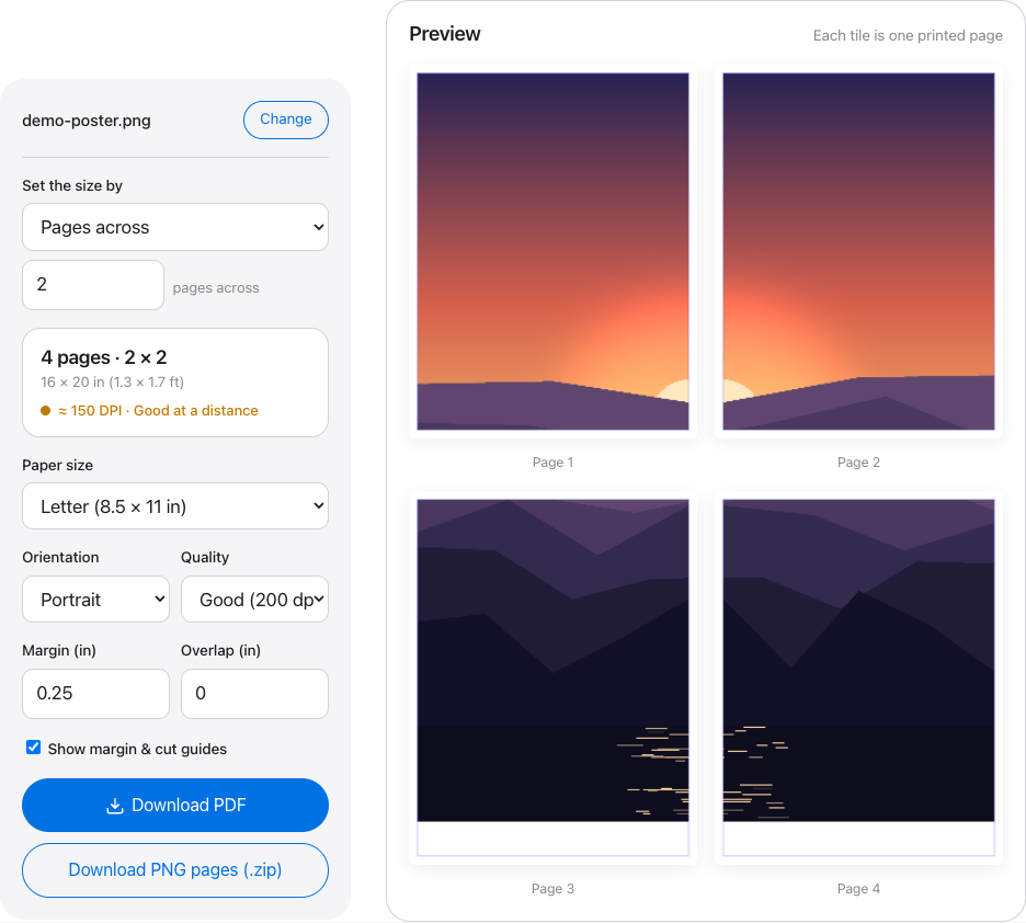
Set the grid whichever way matches how you're thinking. Use "Pages across" if you know you want, say, three pages wide; or type a target width in inches and let the tool work out the page count, including extra rows for tall images. Two pages across on portrait Letter gets you roughly 16 × 20 in — a solid first poster. Three across lands near 24 × 30 in. Everything runs client-side, so the image never uploads anywhere, which also means a 100 MB scan splits as fast as a phone photo.
2. Read the quality readout before printing anything
A one-line readout above the tiles reports the page count, the assembled size, and the effective DPI — how many source pixels land on each printed inch:
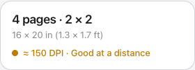
The dot color is the decision. Green (200 DPI and up) survives close inspection. Amber (100–199) looks good from a few feet, which is where posters actually get viewed. Red (under 100) will print visibly blocky — shrink the print, or run the image through the site's upscaler (2× or 4×, with optional sharpening) before splitting. There's no point chasing more than 300 DPI; the export presets cap there because paper and ink can't show the difference.
3. Set margins and overlap
Most inkjets physically can't print the outer few millimeters of a sheet, so leave the margin at 0.25 in unless your printer does borderless. Overlap is optional, but I recommend 0.25 in for a first poster: each page repeats a strip from its neighbor and prints a cut-line guide, so a slightly crooked cut disappears into the overlap instead of opening a white gap between pages. The tool allows up to 2 in of overlap, though past half an inch you're mostly wasting ink.
4. Print at 100% — the step people get wrong
Export a multi-page PDF, or a ZIP of PNGs if you'd rather print images directly. In the print dialog, set scaling to "Actual size" or 100%. "Fit to page" — often the default — shrinks every tile by a few percent, and nothing will line up afterward. Print a single page in draft mode first, measure the printed area with a ruler, and only then run the full set. That one test page has saved me more paper than any other habit.
How big can your image actually go?
Divide the image's pixel width by the print width in inches and you have the DPI. Here's that math done for common source sizes — a phone screenshot, an older phone photo, an AI render, a DSLR shot, a high-res scan:
| Source width | 16 in print | 24 in print | 36 in print | 48 in print |
|---|---|---|---|---|
| 1080 px | 68 DPI | 45 DPI | 30 DPI | 23 DPI |
| 2048 px | 128 DPI | 85 DPI | 57 DPI | 43 DPI |
| 3000 px | 188 DPI | 125 DPI | 83 DPI | 63 DPI |
| 4500 px | 281 DPI | 188 DPI | 125 DPI | 94 DPI |
| 6000 px | 375 DPI | 250 DPI | 167 DPI | 125 DPI |
Read it with the same bands the tool's readout uses: 200 DPI and up (green) is sharp at any viewing distance, 100–199 (amber) is good from a few feet away, and under 100 (red) shows visible pixel blocks. So a 1080 px screenshot has no business being 24 inches wide, while a 4500 px photo handles it comfortably. One honest detail worth knowing: the splitter never downsamples. If your source only supplies 150 DPI at the size you chose, that's exactly what prints, and the readout tells you so before you've spent any ink.
Assembly: where posters are won or lost
Printing is the easy half. The gap between "obviously taped-together printer pages" and "looks like it came from a shop" comes down to three habits, none of which need special equipment.
Trim only the interior edges
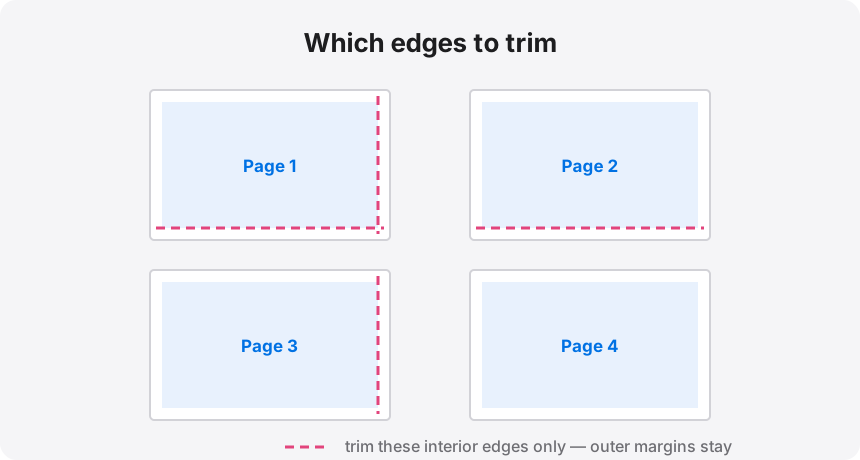
Each seam needs one trimmed edge, not two. Where page 1 meets page 2, cut the margin off page 2's left side and lay it over page 1's untouched edge — half the cuts, and every seam still closes cleanly. The outer margins stay on until the very end; they protect the corners while you handle the sheets, and you can square the whole poster with four final cuts once it's assembled.
Use a metal ruler and a snap-off or X-Acto blade, not scissors. Scissors wander a millimeter or two over an 11-inch cut, and a wavering edge is exactly what makes a seam visible from across the room. A $3 blade against any straight metal edge gives you a dead-straight line — cut on a mat or a flattened cardboard box, and swap the blade the moment it starts dragging instead of slicing.
Tape from behind, in long strips
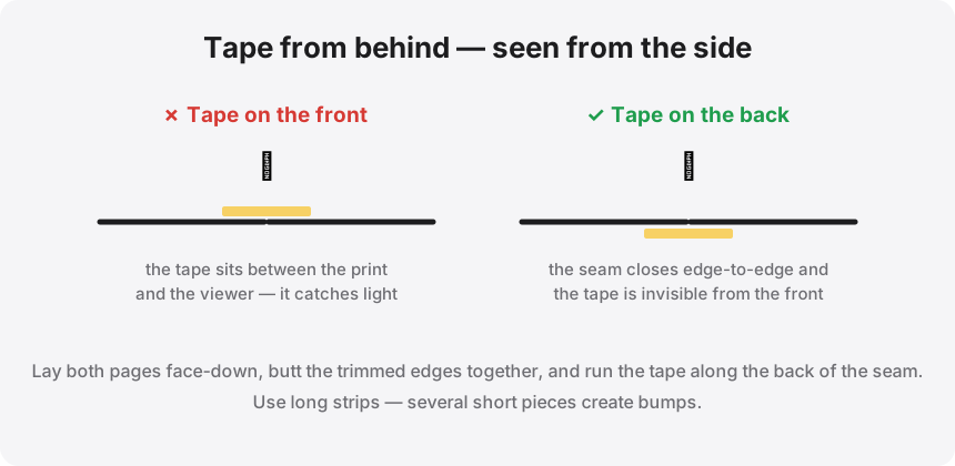
Tape on the front catches light no matter how carefully you press it down, and cheap tape yellows within months. The routine that works: lay both pages face up, align the seam (the overlap strip makes this nearly automatic), hold the join with two small tabs of removable tape on the front, flip the pair over, and run one long continuous strip down the entire back of the seam. Then peel the front tabs off. One long strip also lies flatter than a row of short pieces, which each add a tiny ridge you'll see in raking light.
Mount it if it's staying up
A taped poster hangs fine for a party. For anything living on a wall longer than a month, mount it: a 20 × 30 in foam board costs $2–4 at a dollar or craft store, and a light coat of spray adhesive (or a glue stick worked over the overlap strips) keeps the sheets flat and kills the slight curl printer paper always has. Press each page down with a rolling pin or the edge of a clean ruler, working from the center out.
What it costs
Plain Letter paper from a $10 ream works out to about $0.02 a sheet; decent matte photo paper runs $0.10 or more. Ink for a full-coverage page lands somewhere between $0.05 and $0.15 on a typical cartridge inkjet — tank printers come in well under that, photo paper and heavy coverage push it over. Call it $0.10–0.25 per page all-in.
My 34 × 44 in map was 12 pages: between $1 and $3 in consumables, printed and on the wall the same evening. The local print shop's quote for a color print that size was in the $40–80 range. These are estimates — ink pricing varies wildly between printer models, and shop pricing varies by city — but the gap is wide enough that the conclusion survives any reasonable error bar. Where the shop genuinely wins is media: if you want one glossy, single-sheet photographic print to frame as a gift, pay for it. For a kid's room poster, a garage-wall diagram, a D&D battle map, or anything you'll swap out in a year, tiling wins by an order of magnitude.
When a print goes wrong
The pages don't line up at the seams
Scaling, almost every time. Something between the PDF and the paper resized the tiles — usually "Fit to page" in the print dialog, sometimes a printer-driver setting like "shrink to printable area." Set scale to Actual size / 100%, reprint only the affected pages, and measure one against a page you know is correct. If you printed with overlap, small errors get absorbed by the repeated strip; without it, even a 2% shrink opens a visible white line at every seam.
The print looks soft or blocky
The pixels were never there — this is a source problem, not a printing problem, and the readout flagged it in amber or red before you printed. The splitter never downsamples, so what you saw is what the file could deliver. Your options: print smaller, increase viewing distance (150 DPI genuinely looks good from four feet), or run the image through the upscaler at 2× or 4× and re-split. Upscaling can't invent detail, but it smooths the pixel edges that read as "blocky."
The colors don't match my screen
They never will exactly — your screen emits light and covers a wider color range than ink reflecting off paper can. Bright blues, purples, and saturated reds shift the most. The practical fix is cheap: print one test page of the most colorful tile before running the whole set, then nudge brightness up 5–10% if the print comes back dark (they usually do). Leaving "Printer manages colors" enabled in the driver beats fighting color profiles by hand.
Your printer can already do this
The splitting is two minutes of the twenty: drop an image in, watch the DPI readout go green, download the PDF.